
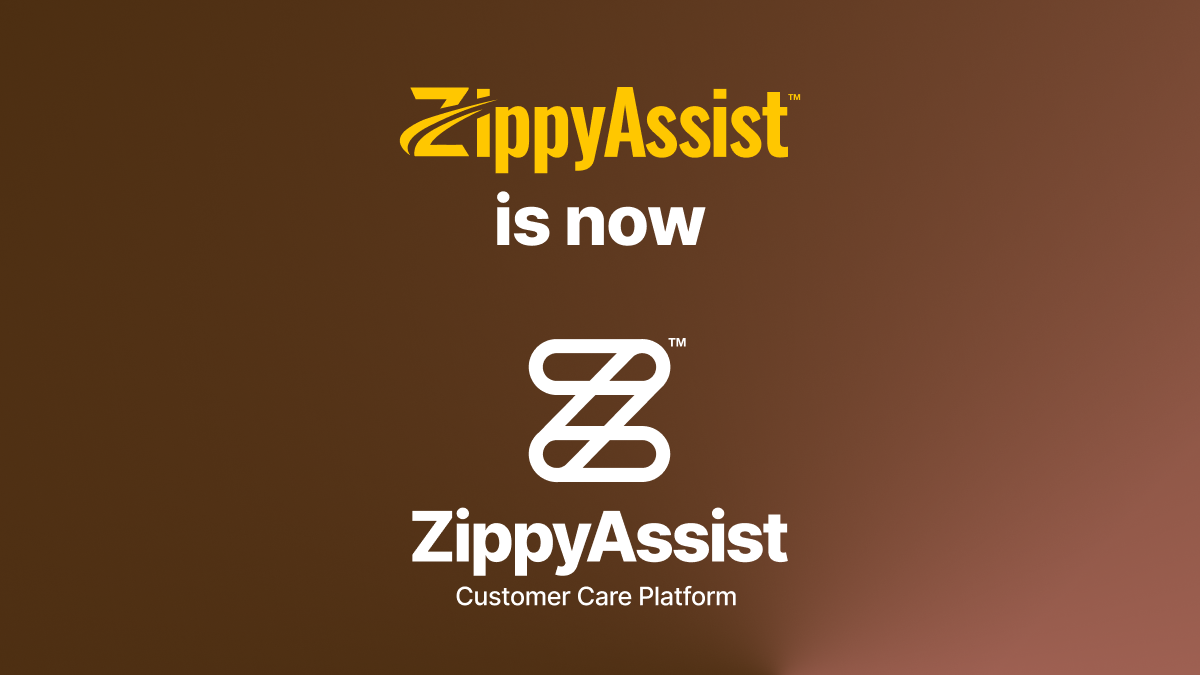
Look ma! New logo.

Logos are peculiar creatures, aren't they? They mean nothing and yet, somehow, everything at the same time. Our old logo has been a faithful companion on our journey, but it was time for a change.
So we've shaken things up – just a bit. Our new logo holds onto the stylized "Z" (because let's face it, "Z" has a cool factor about it) but evolves it with interlocking shapes that tell our story — how ZippyAssist is all about making connections, between people and businesses, that really click.
When it came to a tagline, we opted to do something unconventional and simply use an expression for what is it we do. Which can be harder than it sounds: since the very beginning we've searched for the right 2-3 word combination. What we came up with never quite fit. But after two short (long) years, a tagline sort of found us – Customer Care Platform. It describes exactly what we do, and as ZippyAssist expands into many different markets, it’ll continue to describe the core of our purpose: helping to care for customers.
Why roll out the new look now? We're on the cusp of some developments and are gearing up to enter a new phase in our evolution. It feels like the right time.
While the logo is changing, our core purpose isn't. We're here to help businesses create better experiences for their customers. That's what got us started, that's what keeps us going, and that's what the future holds.